WORKSCOPE:
UX/UI DESIGN
ROLE:
CO-DESIGN LEAD
TIMELINE:
3-4 MONTHS
YEAR:
2024/2025

context.
original design.
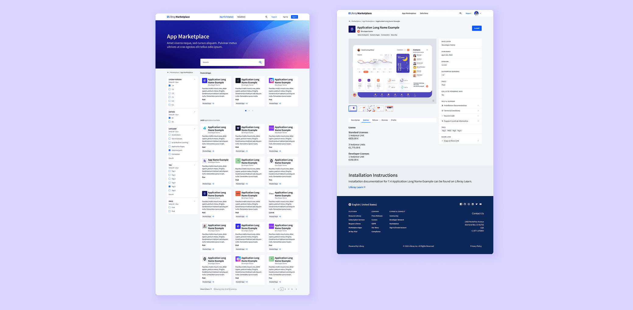
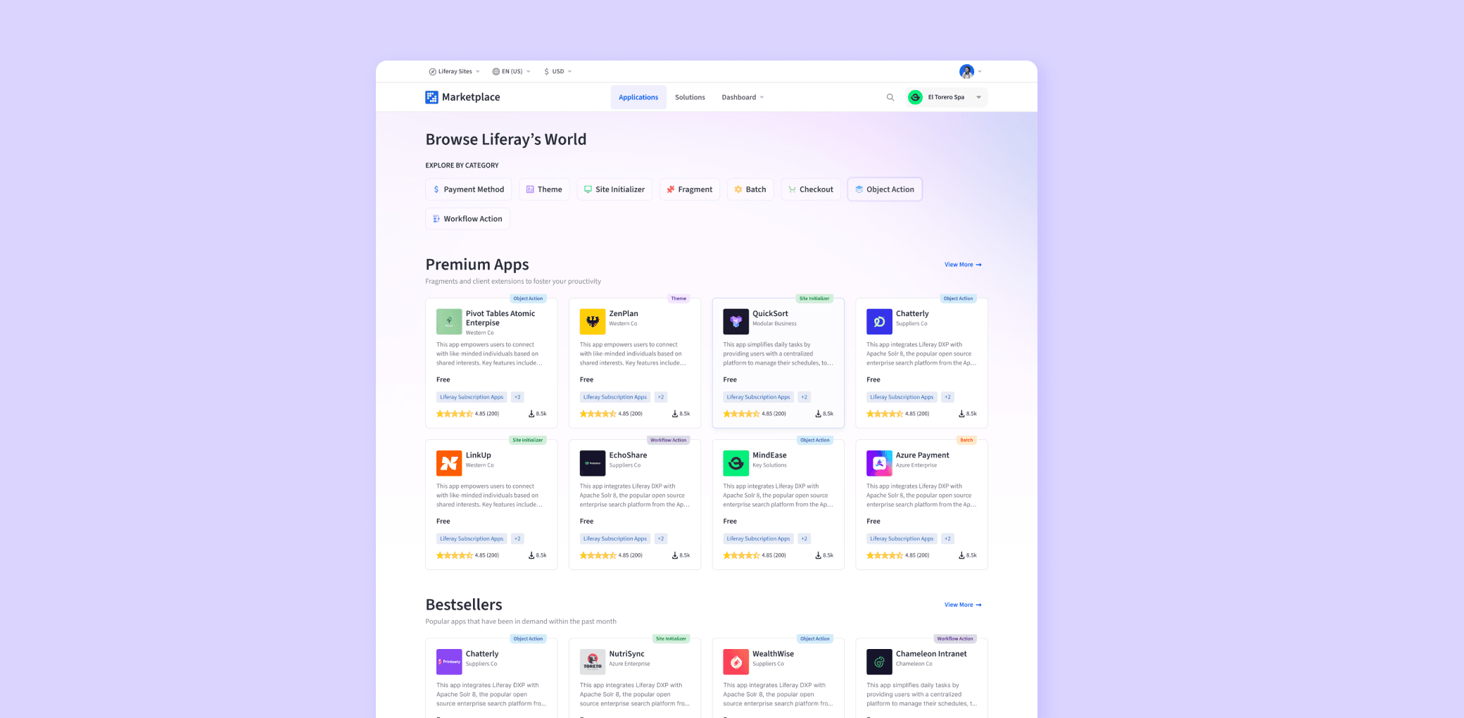
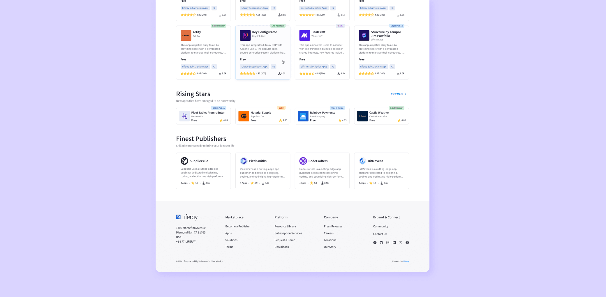
new homepage.
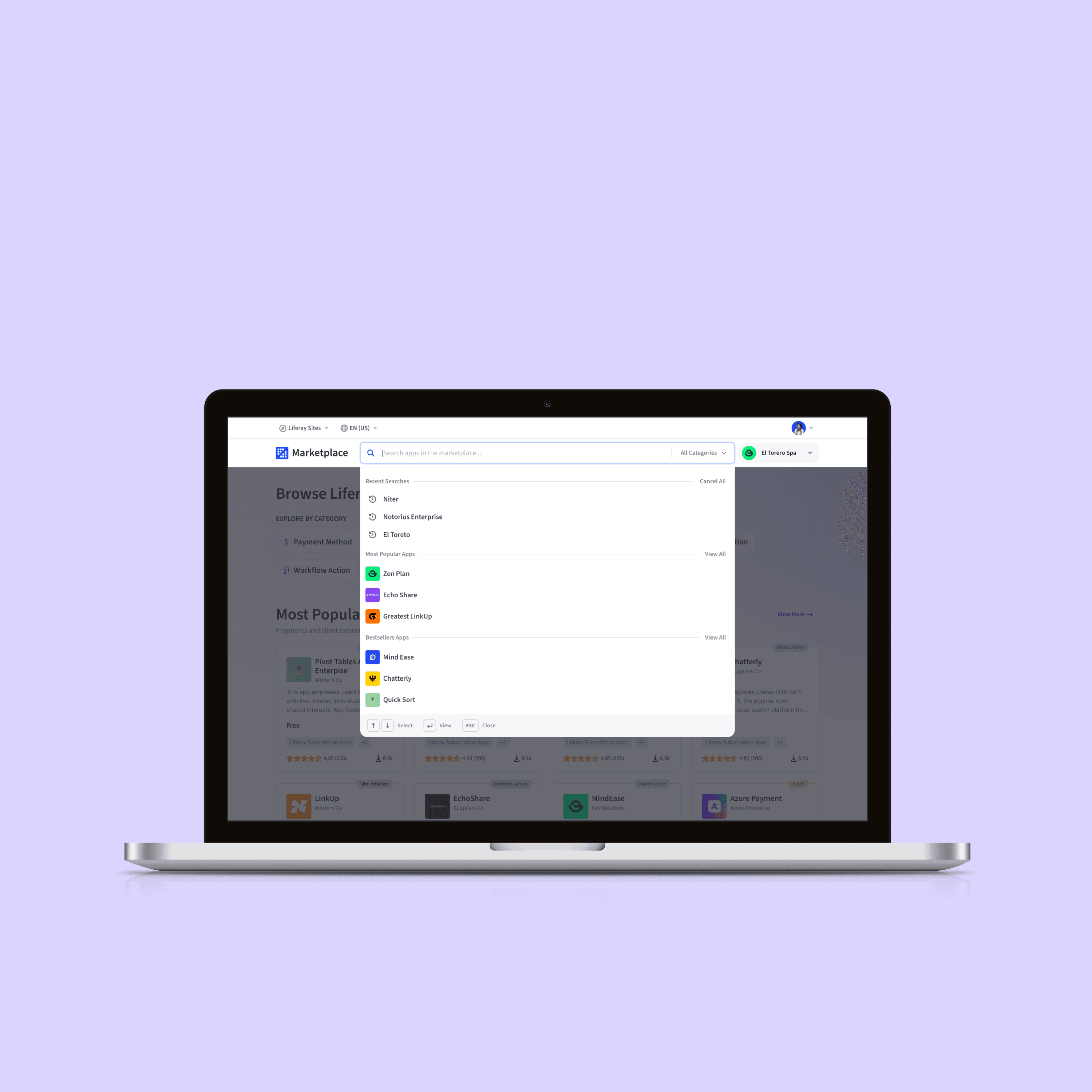
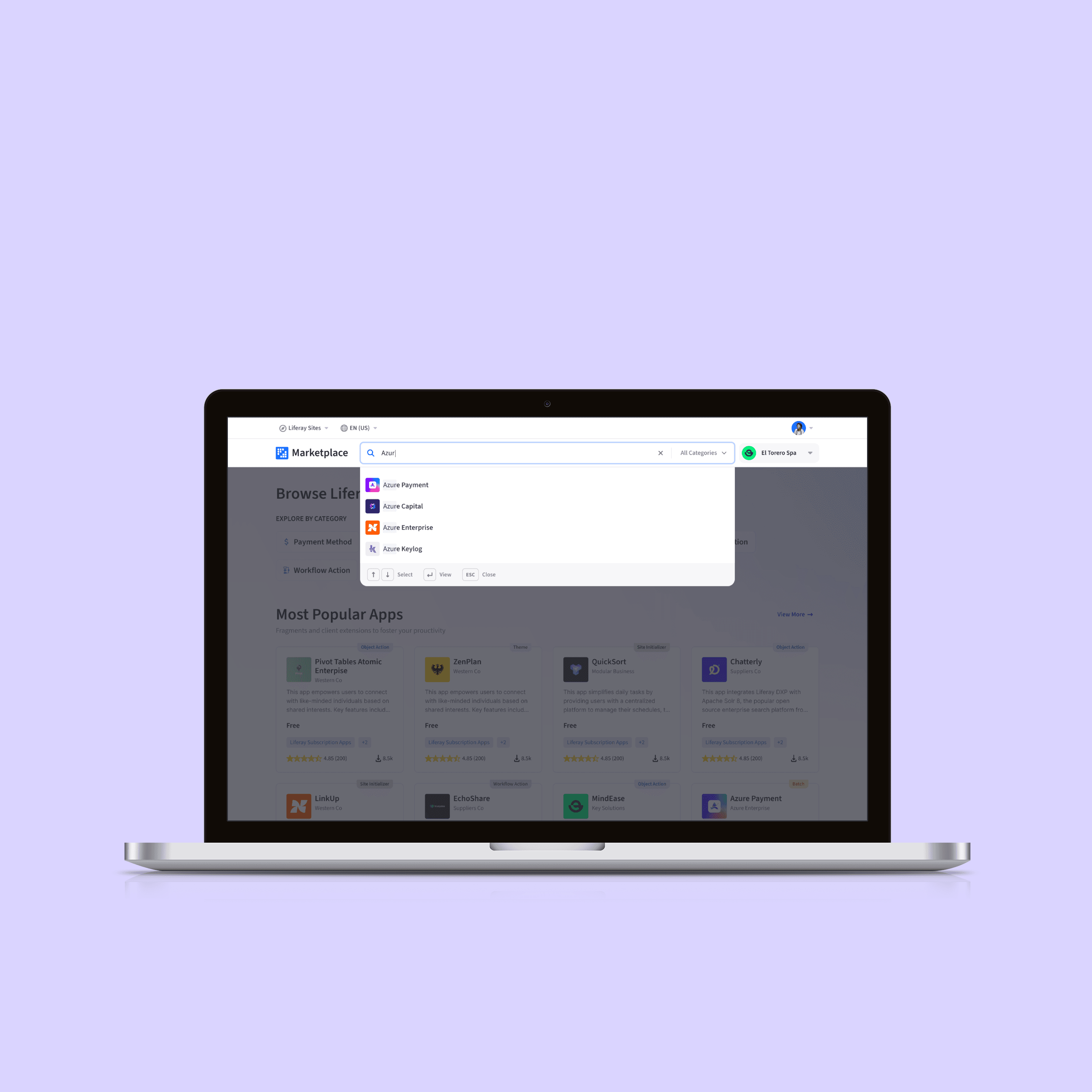
The redesigned marketplace homepage features a fresh gradient background and a flexible layout that highlights various promotional and featured content. Users can explore both technical categories, such as app types, and more emotional groupings, like premium apps or bestsellers, encouraging deeper engagement and discovery. Additionally, a subtler section at the bottom showcases publishers, giving them visibility and helping users get to know the creators behind the apps.
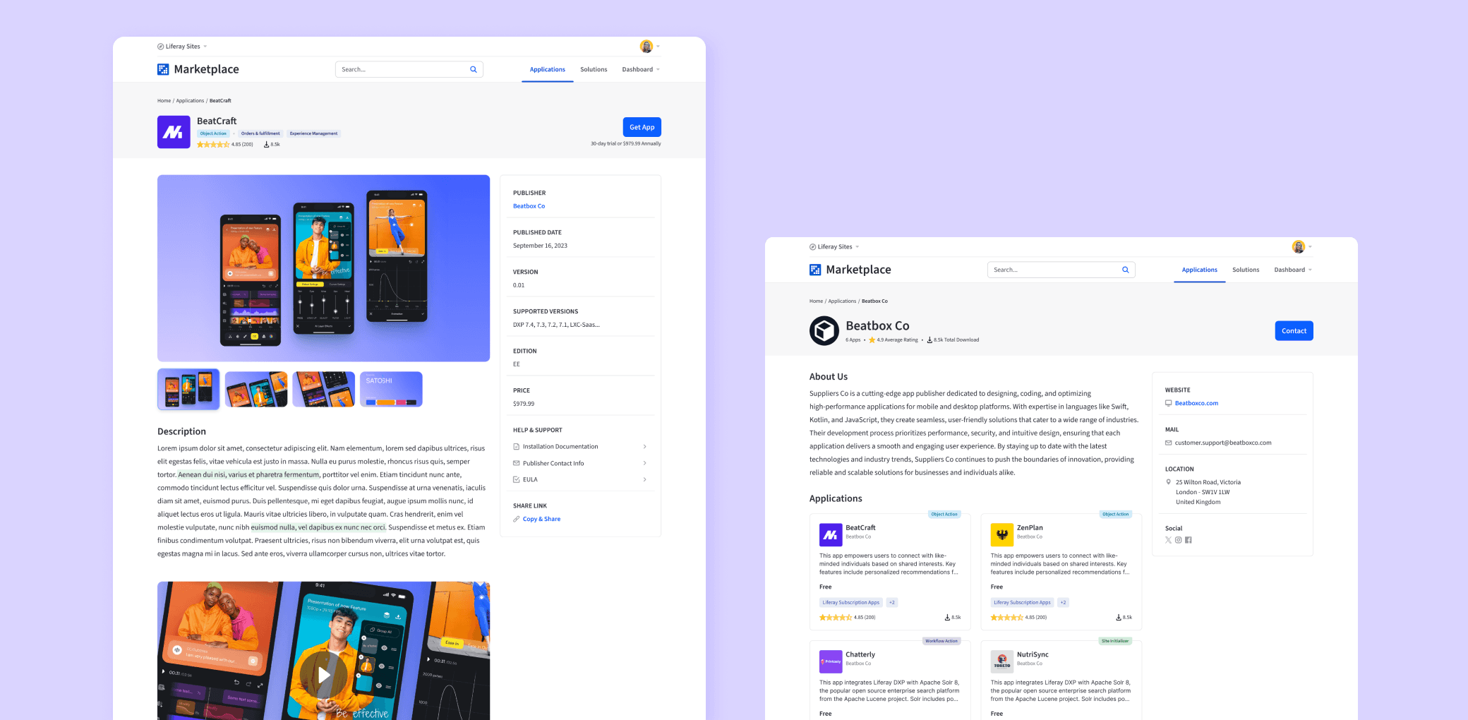
app & publisher detail page.
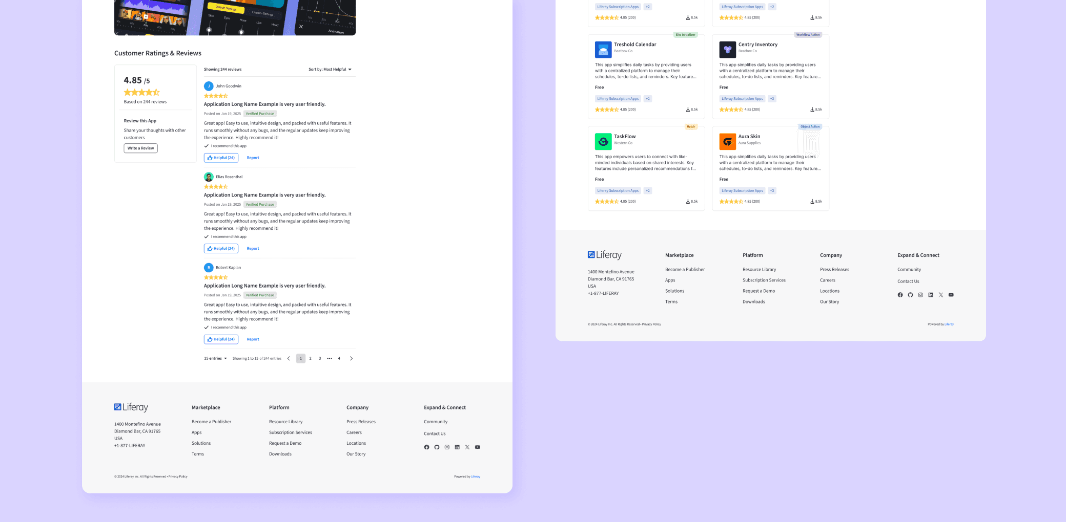
Other redesigned elements include the App Detail Page and the Publisher Detail Page. The App Detail Page features an immersive gallery, video content, highlighted text sections, and a robust ratings and review system. The Publisher Detail Page is more straightforward, showcasing all apps from a publisher while maintaining the same right-hand info block for clear details. The focus on the publisher from the homepage is reinforced in the App Detail Page with a consistently clickable link, leading to a dedicated publisher page.